
Ophelia Fine Jewelry Branding
Fall of 2024 - Personal Project
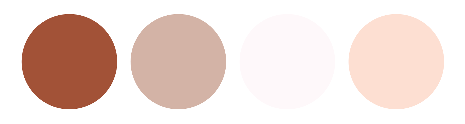
Inspired by the @theglowandgrowclub instagram prompt, I challenged myself to design a theoretical luxury jewelry company's logo suite, packaging design, and general branding based on the provided color palette:
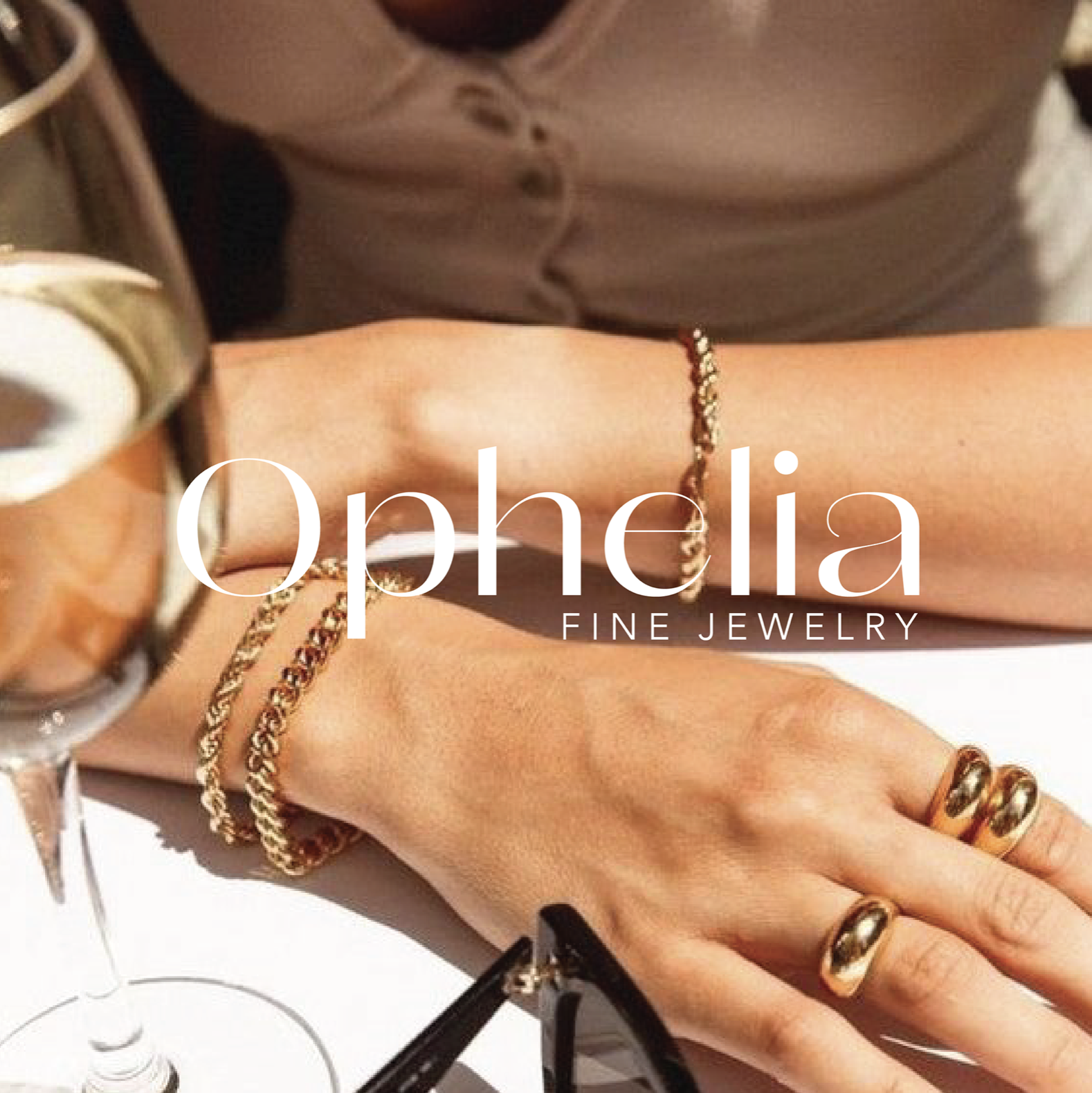
Here is what I created.
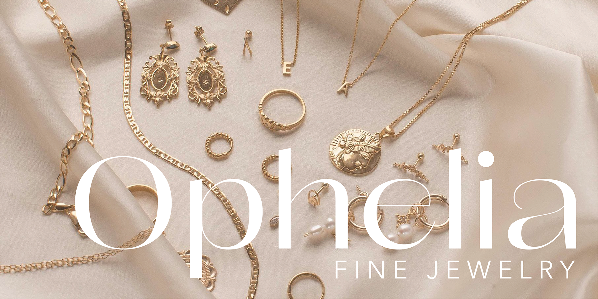

The branding was to be luxurious, high-end, modern, and trendy.
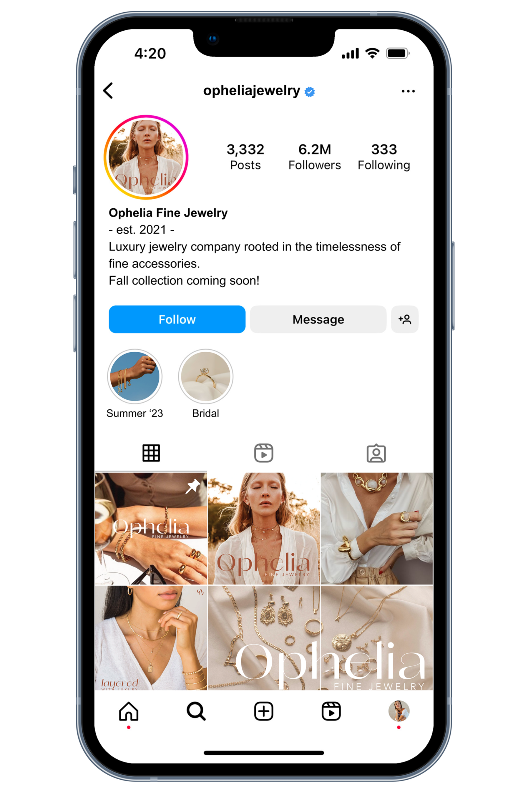
Target audience aged 25-50.

I kept the social media preview simple and refined. I demonstrated the use of collections and live stories to boost potential business and draw a following.


For the packaging, I made sure to include a “trendy” but thoughtful Thank-You enclosure to give the company a touch of class and hear, inspired by that of small businesses and artists when they send their creations to their new owners.
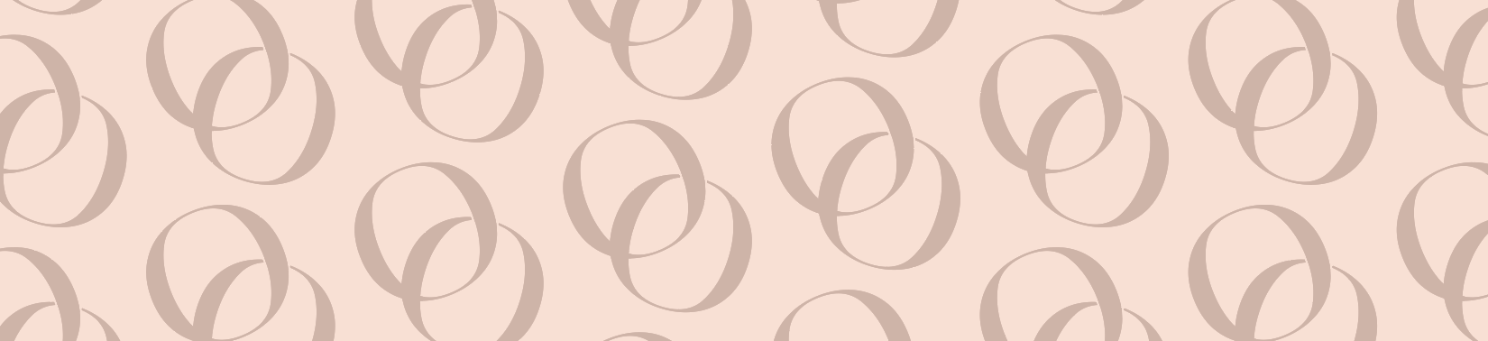
For the logo, I wanted it to be simple and recognizable to mirror that of luxury brands, but with a touch of subtle symbolism. By intertwining the “O” from the name with an angled version of itself, I was able to mimic 2 gold rings- something that the company would be known for selling.

Disclaimer:
Please note that the photos & packaging mockup templates used are not owned by me, and that this project was purely for personal design effort.